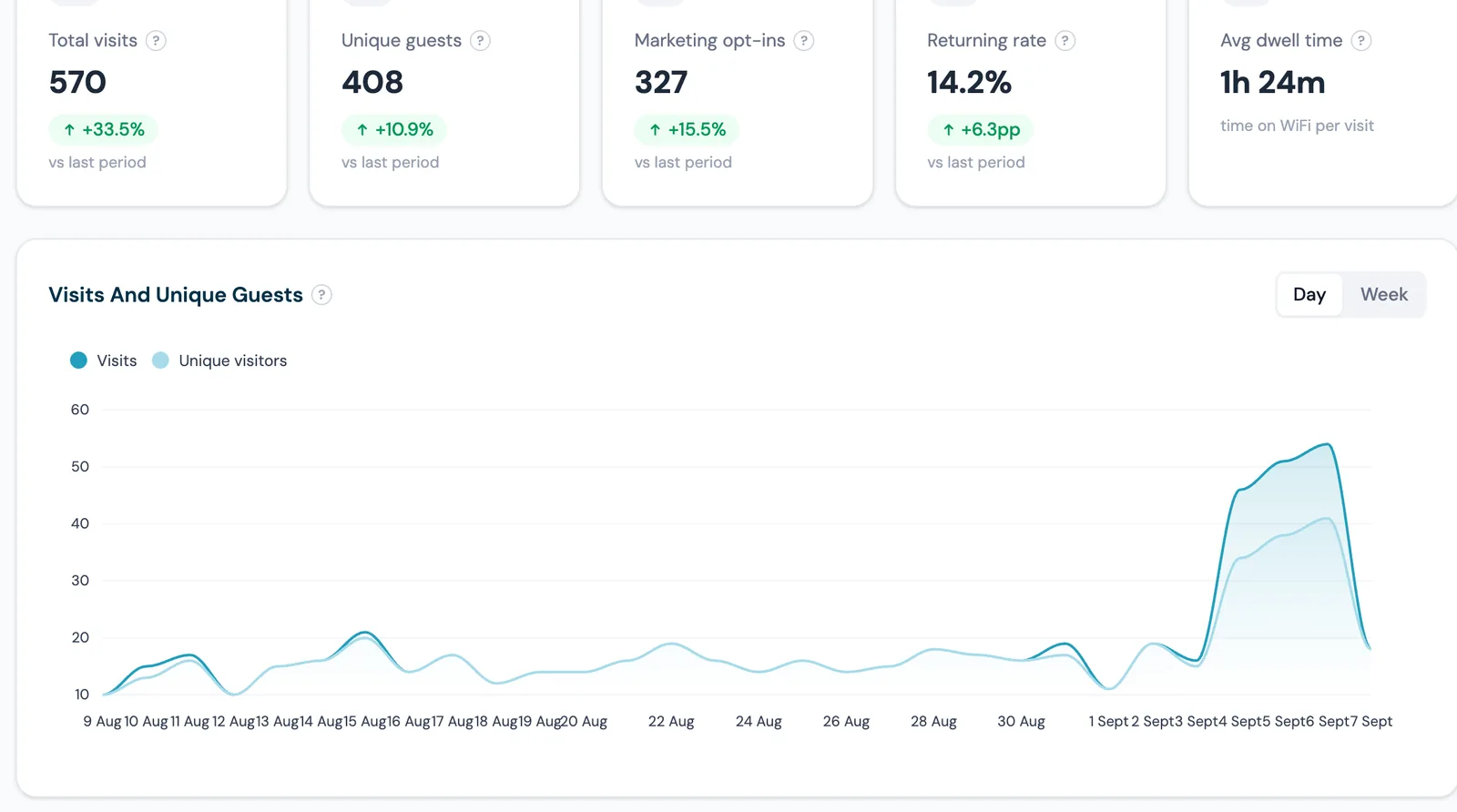
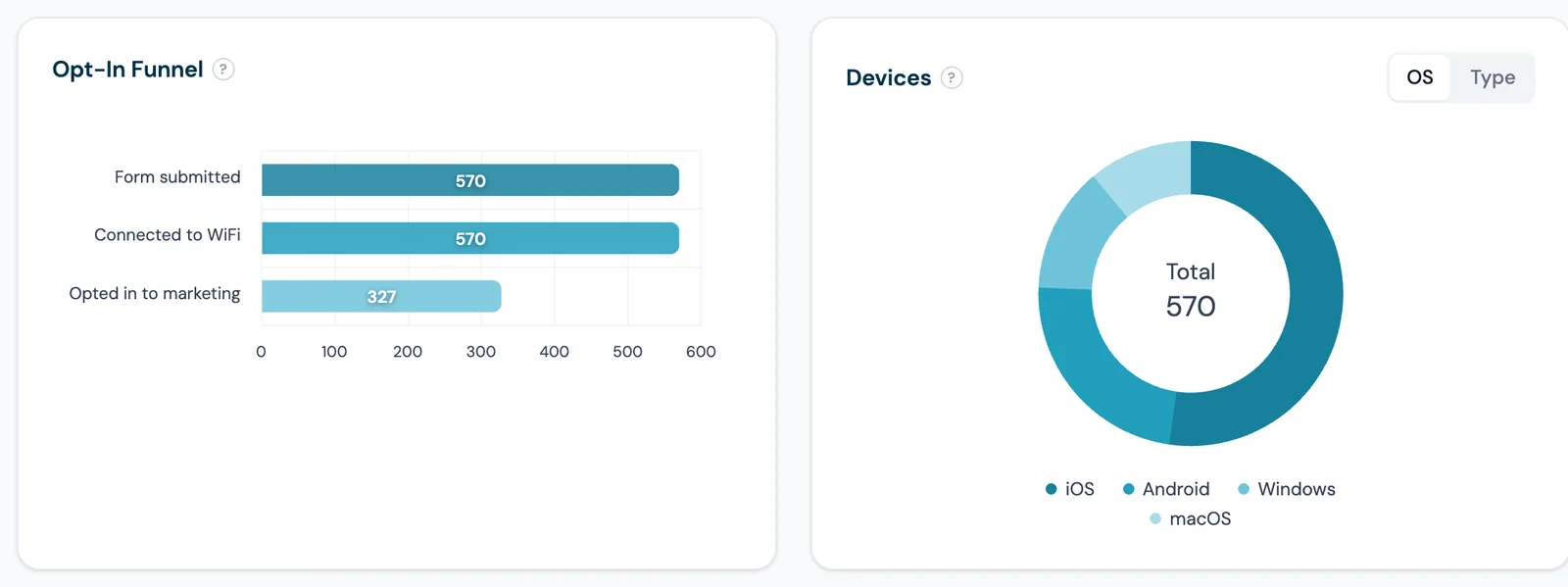
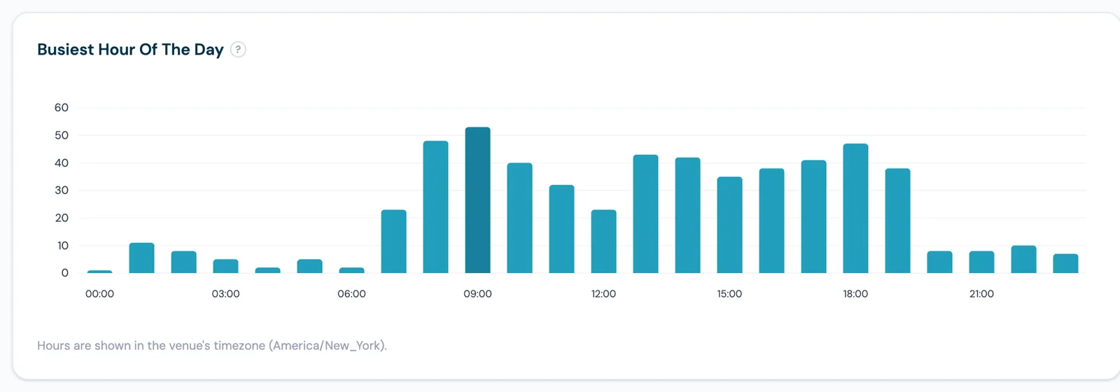
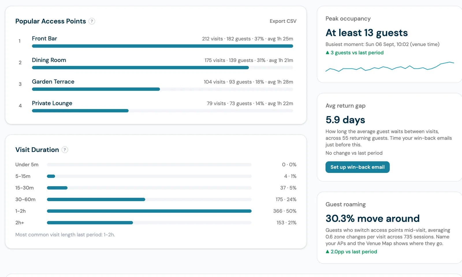
See visits, unique guests, opt-in rate, dwell time, peak occupancy and return gap for any date range, then go deeper: busiest hour in your venue's own timezone, a day-by-hour footfall heatmap, which access point guests connect through, and a heat map of your own floor plan. Built for venue operators, not data scientists.
40-60%
Average Email Opt-In Rate
Under 2 hours
Average Support Reply
11+
Integrations Included
99.9%
Platform Uptime
Most WiFi analytics dashboards are either too basic (Beambox's #1 complaint: ~25 G2 reviews mention limited reporting) or too complex (Purple's UI is called "not intuitive" with a "steep learning curve" by multiple reviewers).
CaptiFi strikes the balance: powerful analytics that are easy to understand. Every chart answers a question an operator actually asks, every number carries a comparison against the previous period, and the reports that suggest an action come with the button to take it. Upload your floor plan and the same data becomes a heat map of your rooms.
Visits, unique guests, opt-in rate, returning rate and average dwell time, each against the previous period
Busiest hour and a day-by-hour footfall heatmap, shown in your venue's own timezone
Popular access points with per-zone dwell time, and a click to filter every chart to one zone
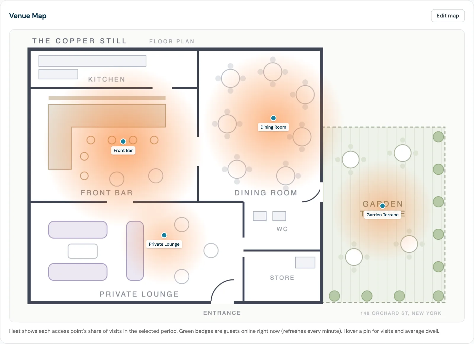
Venue Map: upload a floor plan, place your access points, see heat zones and who is online now
Peak occupancy, average return gap and guest roaming, with a win-back campaign button built in
Cross-location comparison in a single view, CSV export on the rankings and the full guest log
A branded monthly PDF report per venue, generated automatically and emailable (Growth and above)
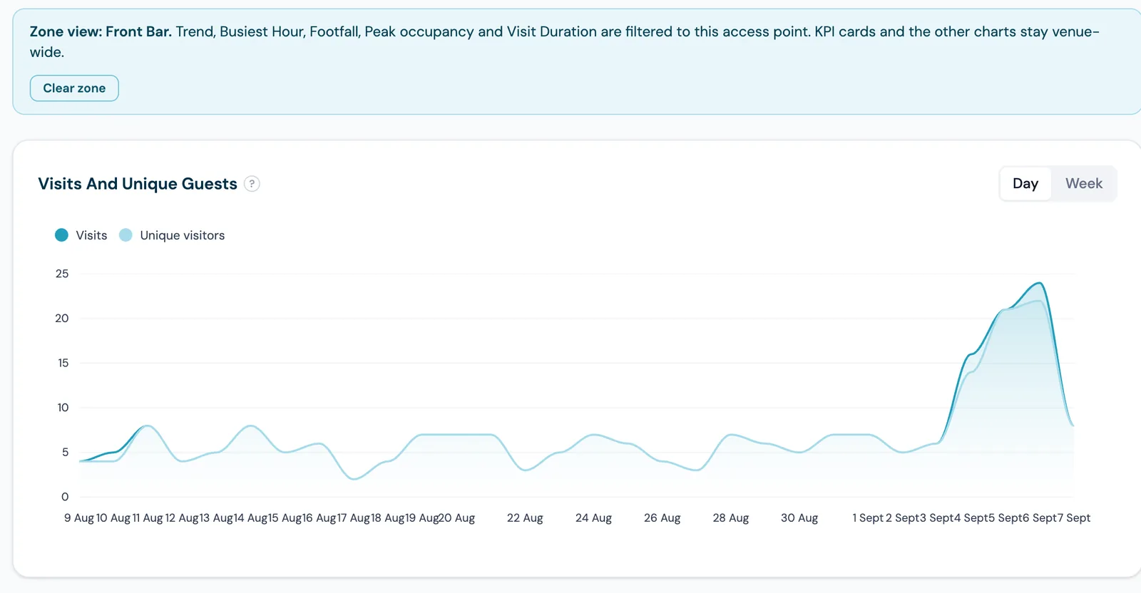
Visits, unique guests, marketing opt-ins, returning rate and average dwell time sit across the top for whichever period you picked, each with the change against the equivalent period before it. Underneath, the trend chart plots visits against unique visitors so a busy week of regulars never looks the same as a busy week of new faces. Toggle it between daily and weekly points.
The funnel follows guests from submitting the form to connecting to reaching the marketing opt-in, so a weak splash page shows up as a step that leaks rather than as a vague low total. Beside it, the device breakdown splits your guests by operating system or by device type, which is the fastest way to catch a splash page that behaves badly on one platform.
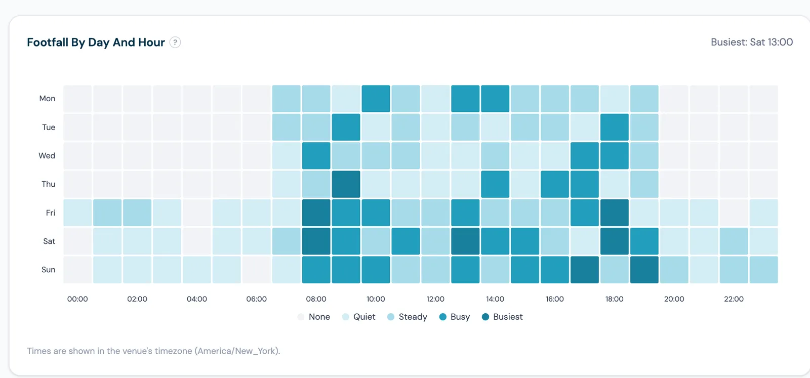
Every visit is bucketed by hour and the peak is highlighted, so the shape of your trading day is obvious at a glance. Times use the selected venue's own timezone rather than a server clock, which matters as soon as you run venues in more than one country: a New York bar and a London pub each read in their own local time.
Rename your access points after the areas they cover and the ranking reads like zone analytics: visits, unique guests, share of the venue and average dwell time for the Front Bar against the Garden Terrace. Around it sit the numbers that turn into decisions. Peak occupancy tells you the most guests online at once and the exact moment it happened. Average return gap tells you how many days a guest waits before coming back, and hands you the button to schedule a win-back email just inside it. Guest roaming shows what share of guests move between areas mid-visit.
Upload an image of your layout, a photo of a printed plan works fine, then drop each access point onto the spot where it actually sits. The map draws a heat blob per access point, biggest at your busiest access point and scaling down from there for the period you are viewing, so the quiet corner and the room that carries the trade stop being opinions. Hover a pin for its visits and average dwell time, and a green badge on each pin counts the guests connected there right now, refreshed every minute.
Click a row in the access point ranking and the page enters zone view: the trend, busiest hour, footfall, peak occupancy and visit duration charts all filter to that area, with a banner naming the zone you are in and a single button to leave it. The KPI cards deliberately stay venue-wide, so you always keep the context of the whole site while you look at one room.
Seven days by twenty-four hours, shaded from quiet to busiest, with the single busiest slot named above the chart. This is the view that settles arguments about staffing, decides when a quiz night should start, and tells you the hour at which an email or text will land while people are actually in the room.
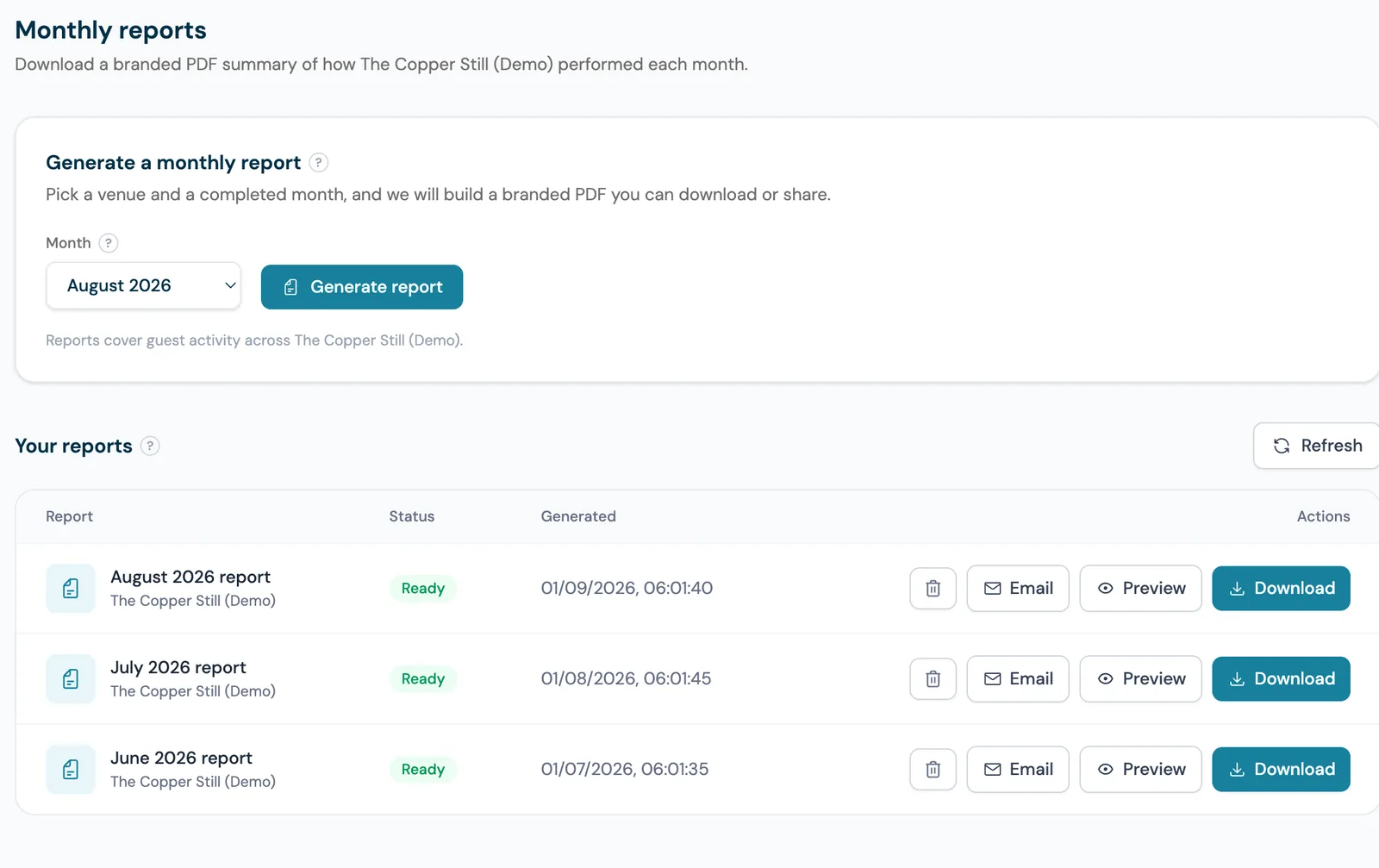
On the Growth plan and above, every completed month is built into a branded PDF per venue, generated for you and kept in a list you can preview, download or email straight from the dashboard. It runs to eight pages, nine once you have more than one venue, and it is the answer to the question a head office or a landlord asks at the end of the month, without anybody assembling a spreadsheet.
A WiFi analytics dashboard turns guest logins into venue reporting. Every time somebody connects to your guest network through a CaptiFi splash page, CaptiFi records the visit, which access point served it, how long the session lasted, the device it came from and whether that guest has been in before. The dashboard reads that back as the numbers an operator runs a venue on: how many people came, how many were new, how long they stayed, when the room fills up and which part of the building they actually used.
A visit is a connection. A unique guest is a person. Anything on the page that counts people rather than connections identifies a returning guest by their email address first, then their mobile number if your splash page collects a phone instead of an email, then their device if the form collects neither. So a guest who connects five times in one afternoon is one unique guest and five visits, and a phone-capture splash page counts people just as accurately as an email-capture one.
Yes, and CaptiFi does it from the access points you already own. Upload an image of your floor plan on the Venue Map card, drop each access point onto the spot where it sits, and the map draws a heat blob per access point, biggest at your busiest access point and scaling down from there for the period you are viewing. It is honest about what it measures: heat reflects which access point a guest connected through, so it shows activity by area rather than a position for any individual. No beacons, no cameras, no extra sensors.
Dwell time is how long a guest is connected across a visit day. CaptiFi takes it from live session tracking where your hardware reports it, from UniFi session data or a CaptiFi device's own disconnect records, and falls back to your authorised session length where it does not. It is shown three ways: as an average across the venue in the KPI band, as an average per access point in the ranking, so you can see that the garden holds people longer than the bar, and as bands in Visit Duration, from under five minutes up to two hours and beyond, with the previous period's most common length for comparison.
CaptiFi is a guest WiFi marketing platform for venues, restaurants, hotels, cafés, retail spaces and short-term rentals. It turns branded WiFi logins into first-party customer data, automated Google review requests, repeat visitor insights and email marketing lists.
Open Analytics, choose Last 24 hours, 7, 30 or 90 days or a custom range, and pick a venue with the switcher. Every card on the page recalculates, and each headline number shows the change against the equivalent previous period.
Total visits, unique guests, marketing opt-ins, returning rate and average dwell time sit across the top. Visits count connections, unique guests count people, so a guest who connects five times in a day is one guest and five visits.
Busiest Hour Of The Day and the Footfall By Day And Hour heatmap show when your venue actually fills up, in the venue's own local timezone. Use them for staffing and for choosing when to send a campaign.
Rename each access point after the area it covers, for example Front Bar or Garden Terrace. Popular Access Points then ranks your areas by visits with an average dwell time each, and clicking a row filters the trend, busiest hour, footfall, peak occupancy and visit duration charts to that zone.
On the Venue Map card, upload an image of your layout (a photo of a printed plan is fine), click Edit map and place each access point where it sits. The map then shows a heat blob per access point, biggest at your busiest and scaling down from there, plus a green badge with the guests online there right now.
Average return gap gives you the number of days the average guest waits between visits, with a button that opens the campaign builder timed just inside it. Export the access point ranking or the full guest log as CSV, or download the branded monthly PDF from Reports on the Growth plan and above.
Nothing here needs a query to be written or a spreadsheet to be exported. Pick a date range and a venue, and read.
A report that is not on your plan is not hidden. The card stays where it is, names the report, explains what it would tell you and offers the upgrade, so you always know what the platform can do. Pricing is shown in your own currency on the pricing page.
Name your access points after the bar, the garden and the function room, then read the ranking. Dwell time per area settles whether the garden is worth the staffing, and the footfall grid tells you which hour a quiz night should start.
Peak occupancy and busiest hour show real cover pressure by hour rather than by service. Average return gap gives you the exact window in which a win-back email still catches a diner before they choose somewhere else.
Visit duration bands separate the takeaway trade from the laptop crowd, and the trend chart shows whether a promotion brought new faces or simply moved your regulars to a different hour.
Upload the floor plan and the heat map shows which lounges and meeting rooms are actually used. Guest roaming shows how much movement there is between areas, which is the argument for or against a new access point.
Top Venues ranks every location on one screen, and the branded monthly PDF gives each site manager the same report in the same format without anybody assembling it.
The footfall grid shows the hours that are genuinely full against the hours that only feel full, and the returning rate tells you whether new joiners are actually coming back.
CaptiFi completely changed my business. Before, every guest was a one-time booking. Now I have a direct line to thousands of people who've stayed in the plane. I can offer them return deals, send updates about new features, and keep them engaged. My repeat booking rate went from almost zero to 35%. It's been incredible.
Owner, PytchAir Boeing 727 Airbnb
Start your 30-day free trial today. Hardware included (refundable hold), no setup costs, cancel anytime.
On the Growth plan and above, CaptiFi generates an eight-page performance report for your venue every month, nine pages once you have more than one venue, packed with charts, heatmaps, an ROI estimate, and actionable insights.
Eight-page report with charts, heatmaps & insights